
Limited edition archival prints
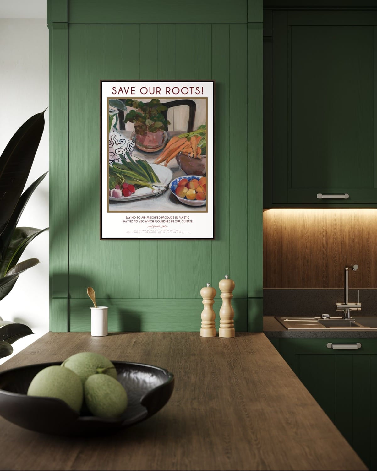
This year I took a risk and combined extracts from my original oil paintings with words. I paid a graphic designer to help with the typography and a fine-art printing company to make the prints. Thanks to the technology available to artists today I can transform stunning, highly-pigmented reproductions of my art into something new - posters with a message.
I’m not the first artist to blend fine art with commercial design. Artists like Toulouse-Lautrec collaborated on poster design for cabarets like the Moulin Rouge, taking advantage of possibilities offered by a new colour-printing technology called lithography.
And in the first half of the twentieth century, railways, airlines, and tourist boards all commissioned artists.
The London Underground is a particularly inspiring example. The legendary Frank Pick was the man responsible for publicity and design. He believed deeply that good design was a moral and civic duty — that beauty should not be confined to galleries, but encountered daily by ordinary people.
He deliberately avoided overt commercialism; many of the posters he sponsored were purely cultural, promoting museums, parks, theatre, or seasonal beauty. This was radical — a public transport company funding art for its own sake. He made the case that the public realm deserved beauty, and that commissioning artists wasn’t indulgent — it was part of building a humane society.
I love this ethos and I’ve been captivated by these posters ever since I was a teenager. I’ve now got my own small collection of London Underground vintage lithographs.
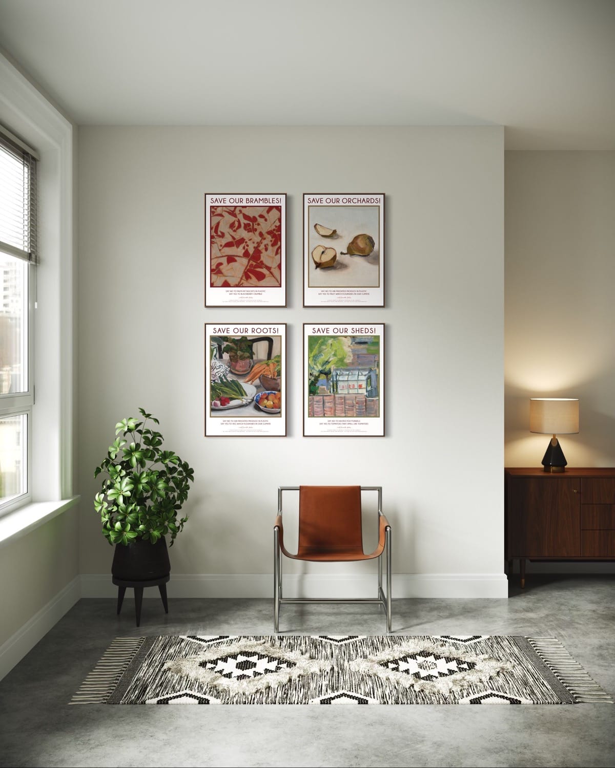
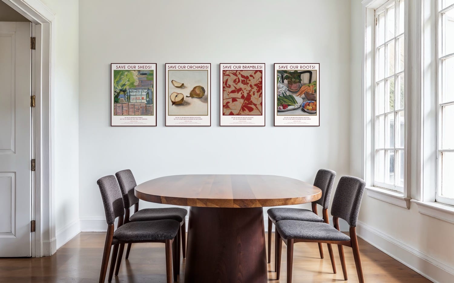
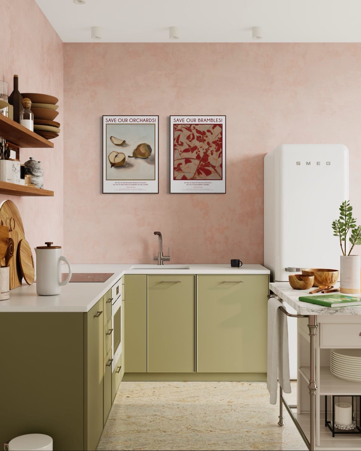
For a long time I’ve wanted to make my own version of poster art, using a theme very close to my heart - food and farming. I’ve just launched the first four prints in what I hope will be a larger series. I hope you enjoy them!